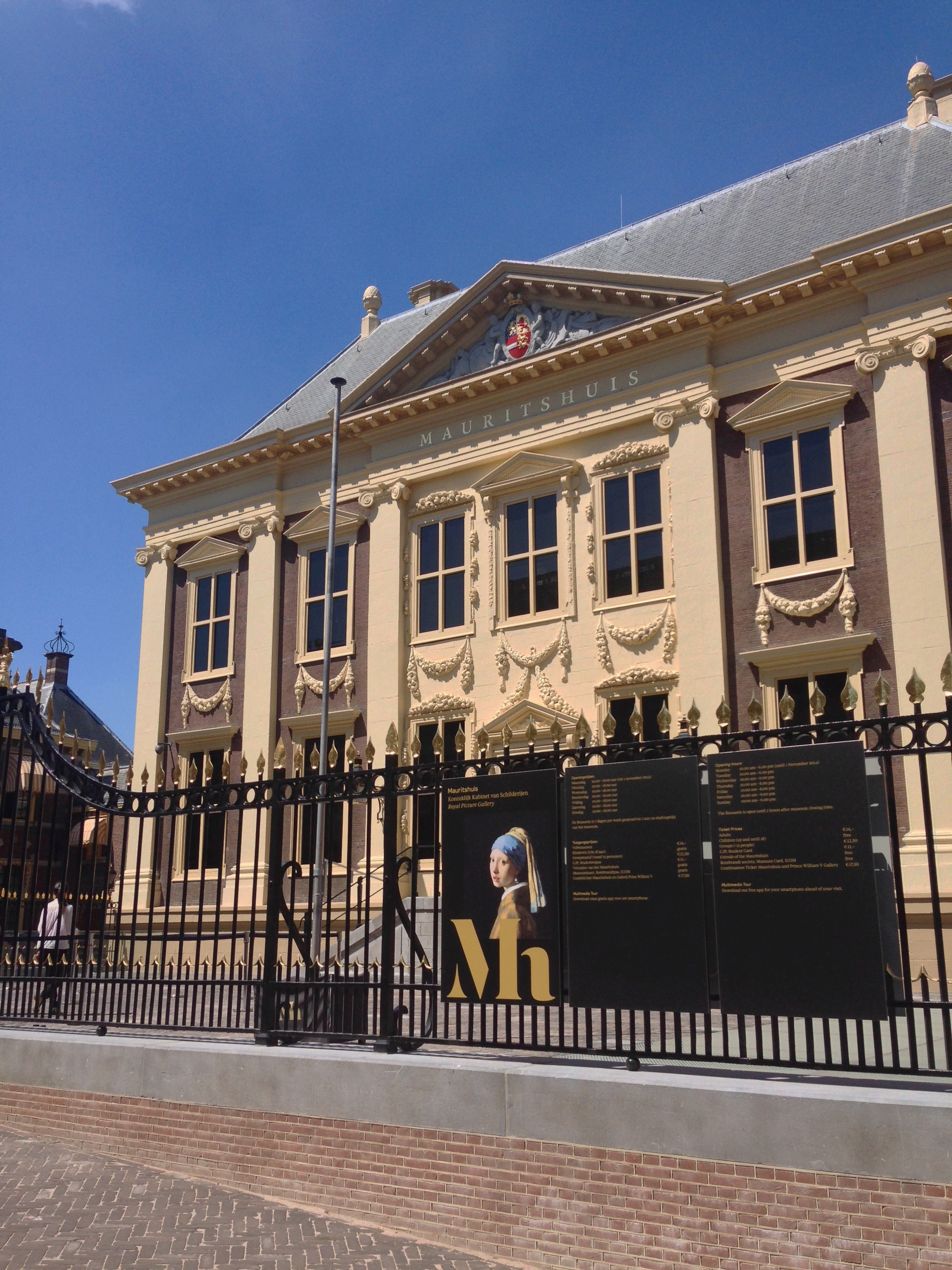
Mauritshuis — A new identity for the home of Dutch Golden Age painting
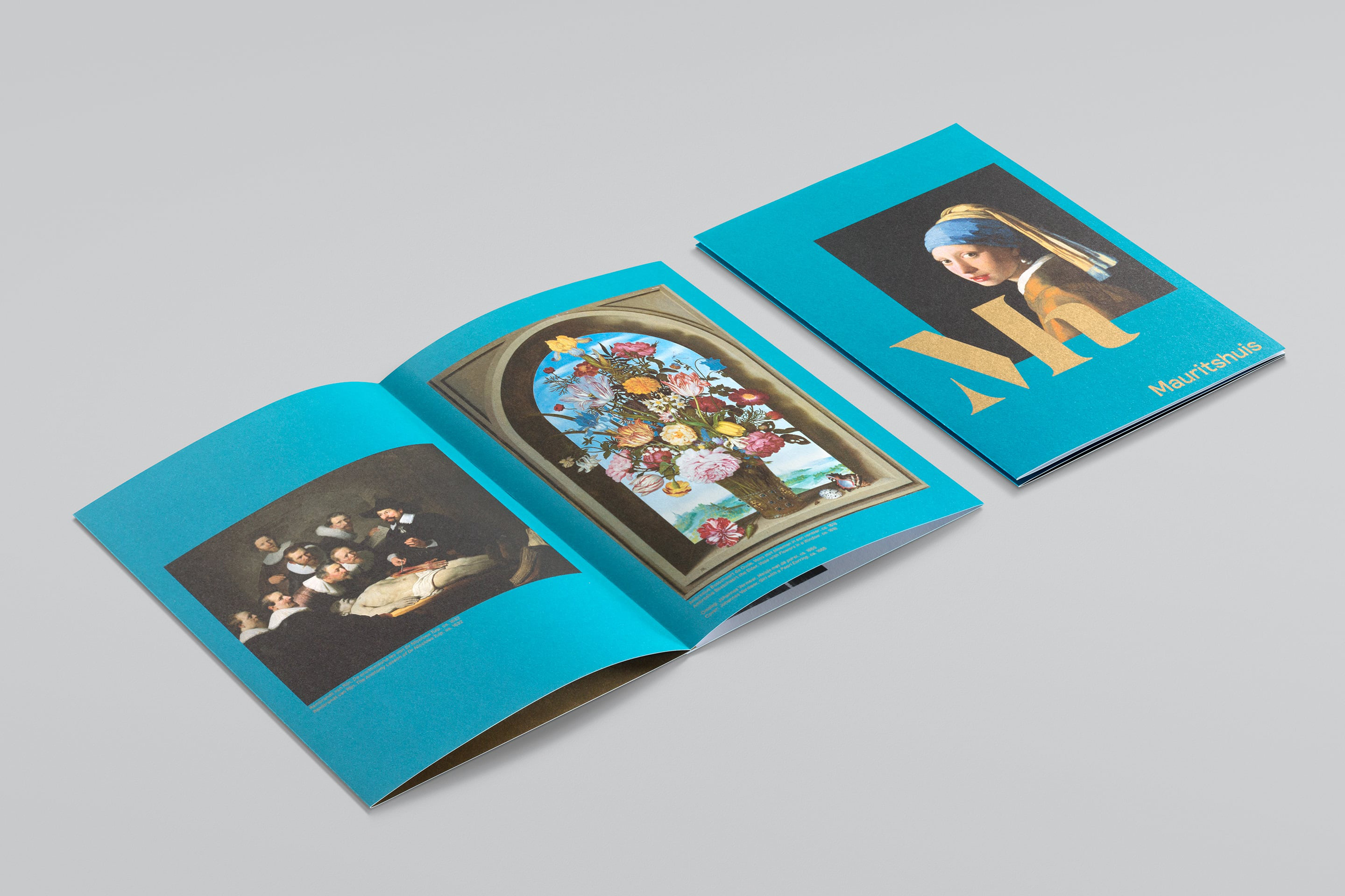
Built in the 17th century, the Mauritshuis is a fine example of Dutch Classicist architecture. Home to the Royal Picture Gallery since 1822, its opulent rooms are filled with Golden Age masterpieces including Vermeer's ‘Girl with a Pearl Earring’ (c.1665), ‘The Goldfinch’ (1654) by Carel Fabritius, and Rembrandt’s ‘The Anatomy Lesson of Dr Nicolaes Tulp’ (1632).
Strategy
Prestige and heritage were at the heart of our strategy. It was important to celebrate the museum’s history, symbolising an era of extraordinary success and prosperity for the Netherlands, both culturally and economically. However, it was equally important to make visible connections with the future; making sure the museum appeals to 21st century audiences and communication technologies.
Design
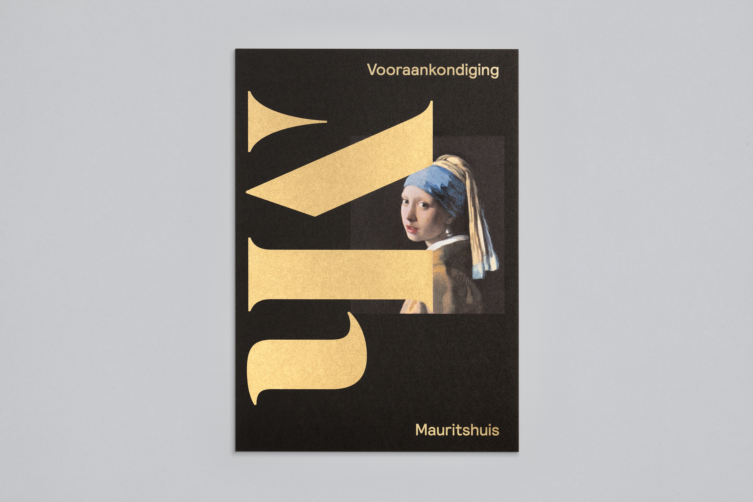
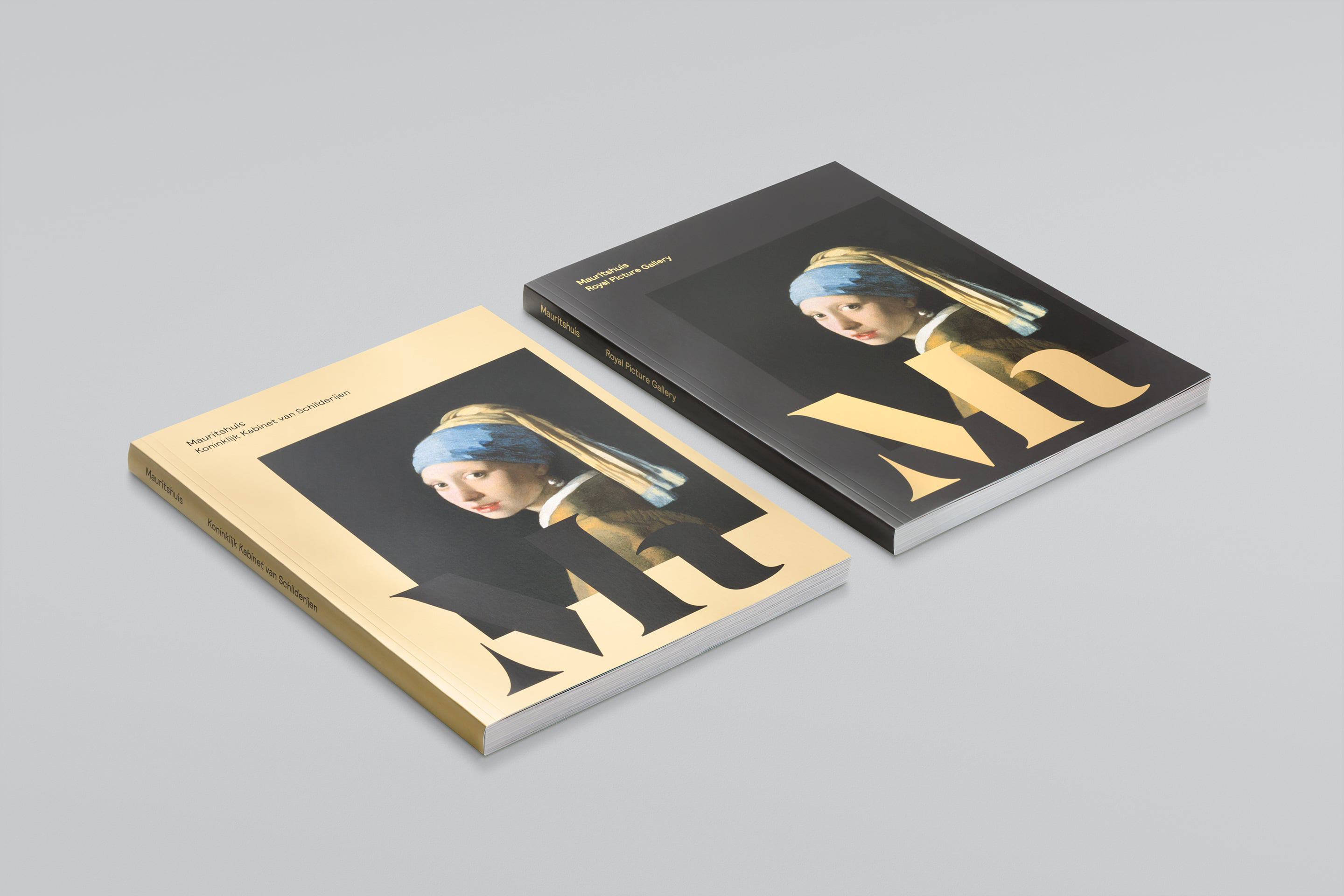
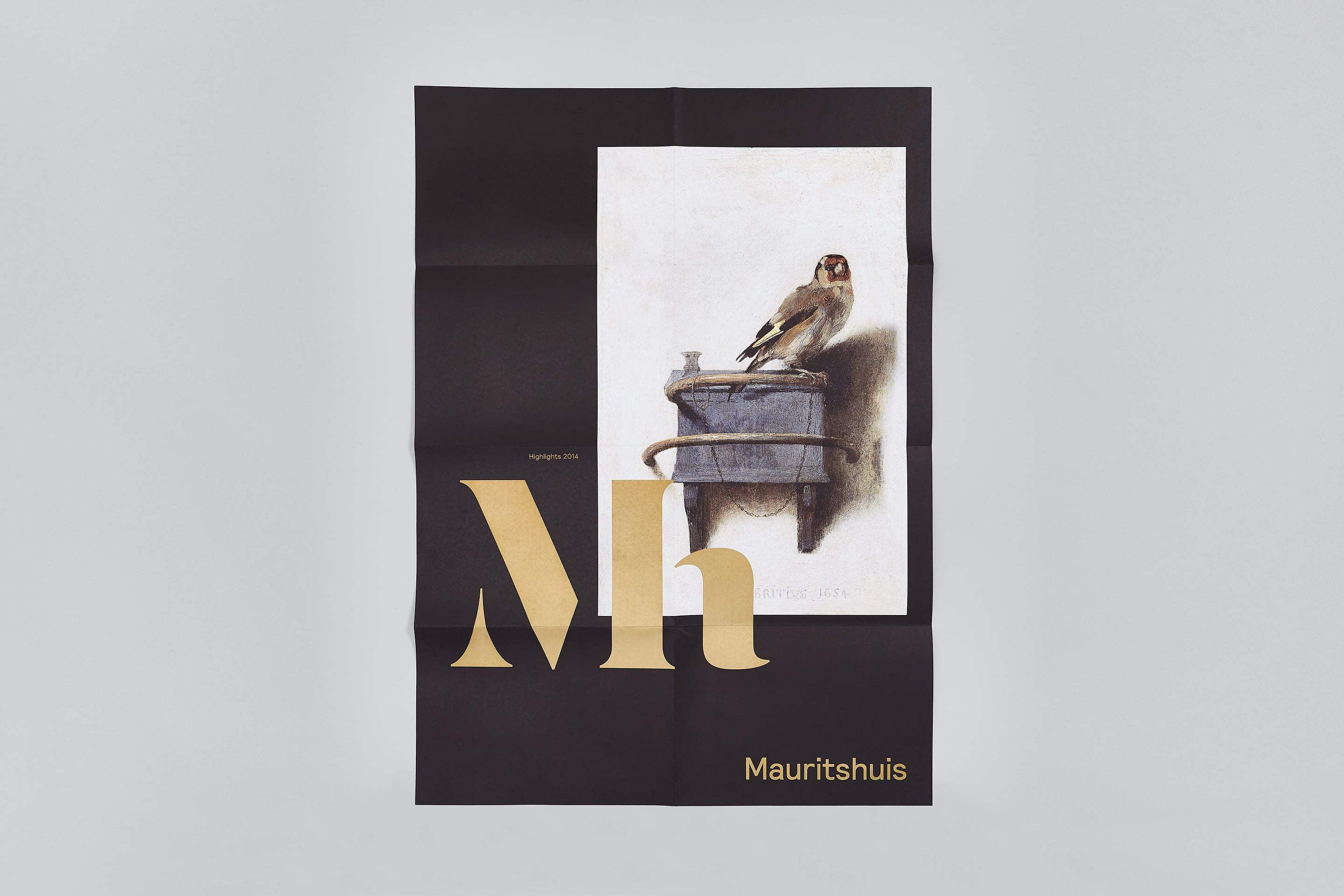
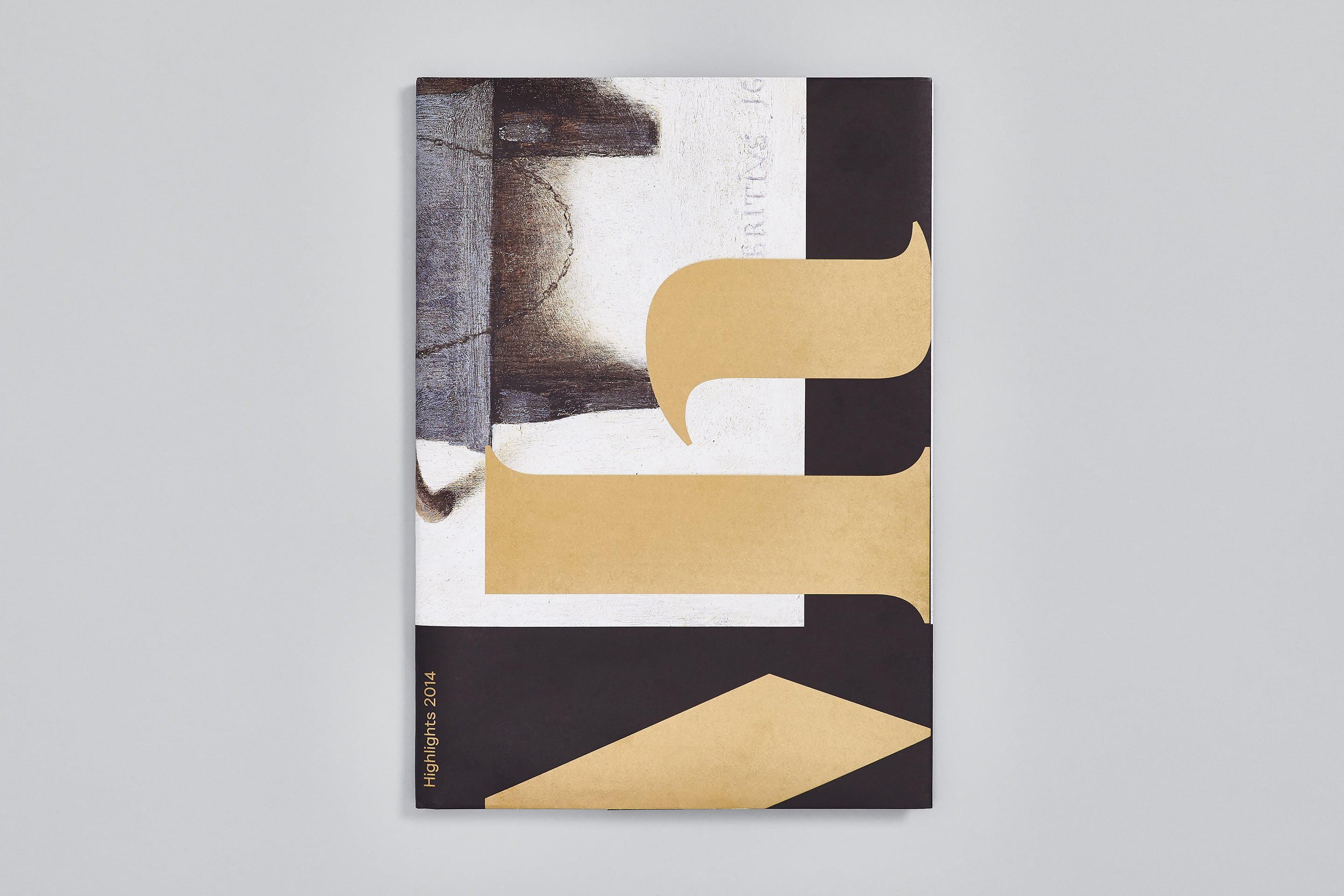
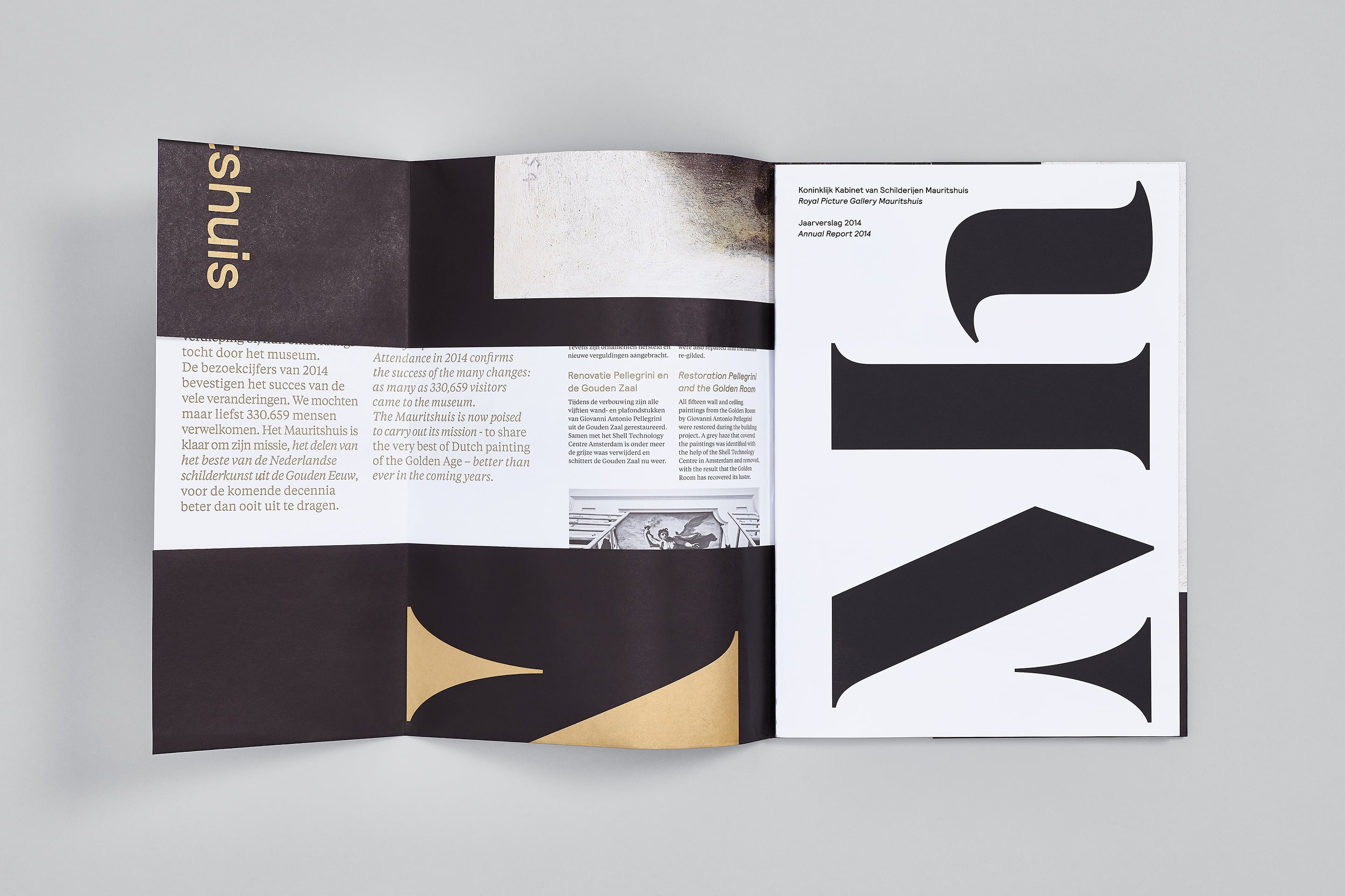
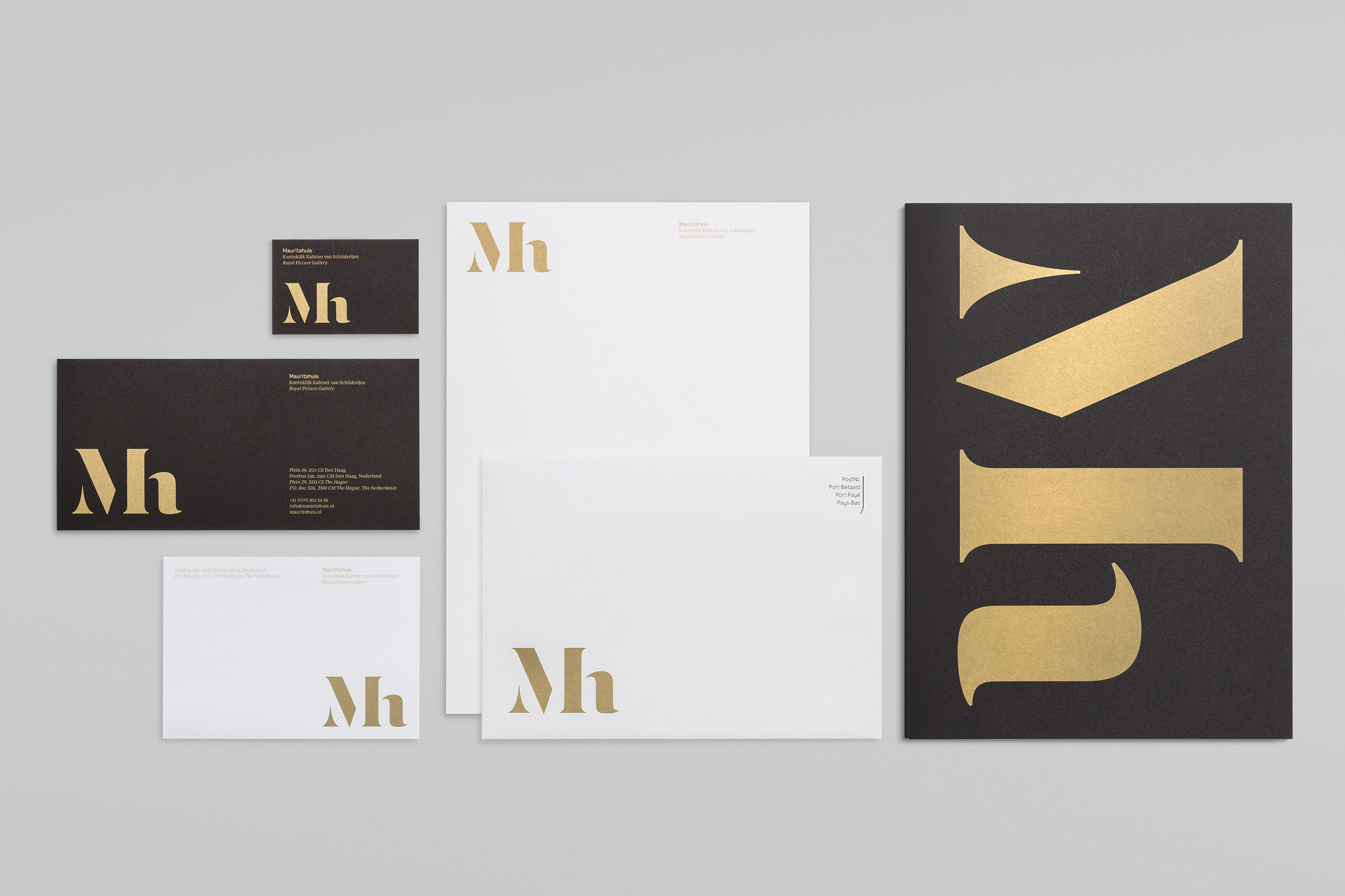
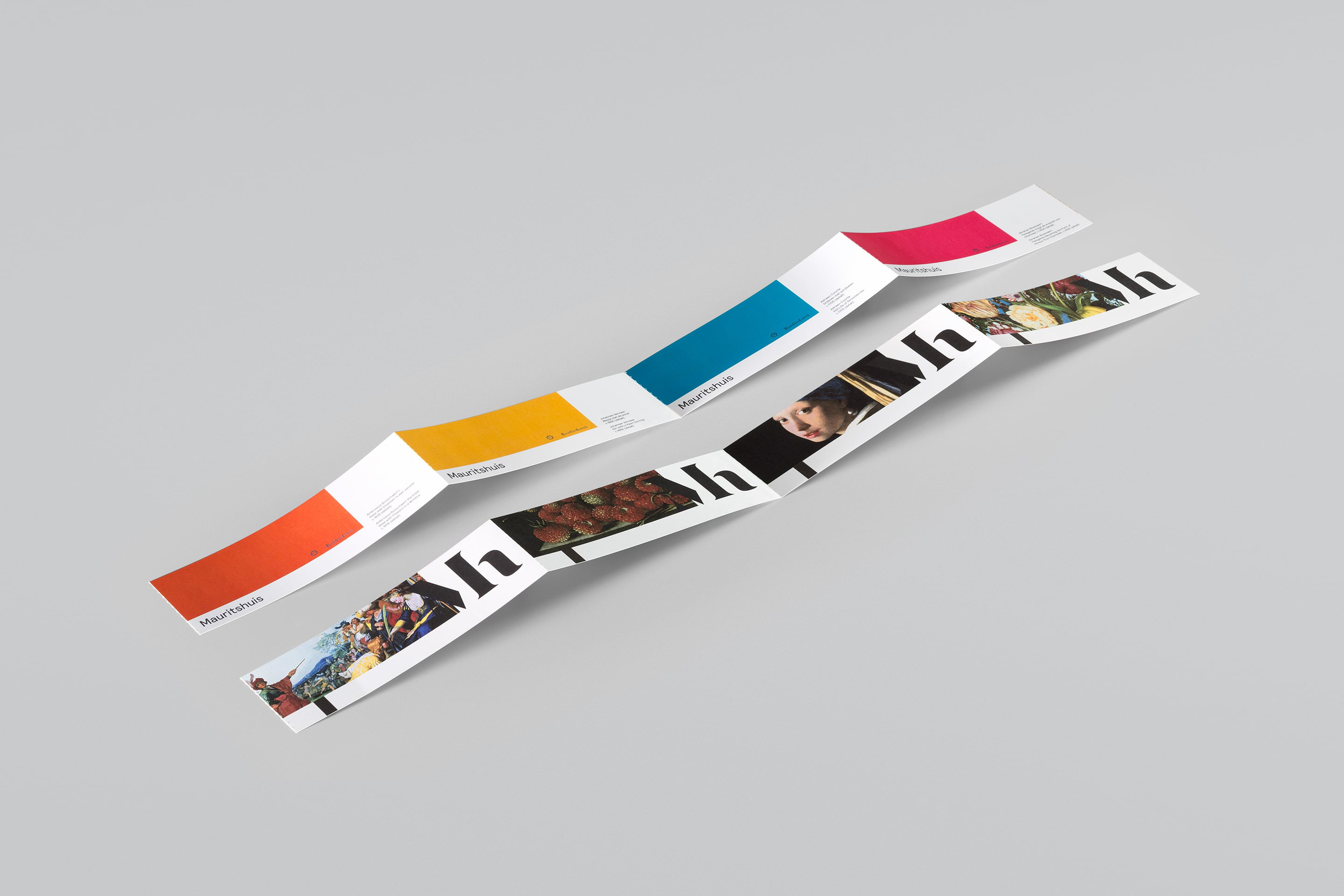
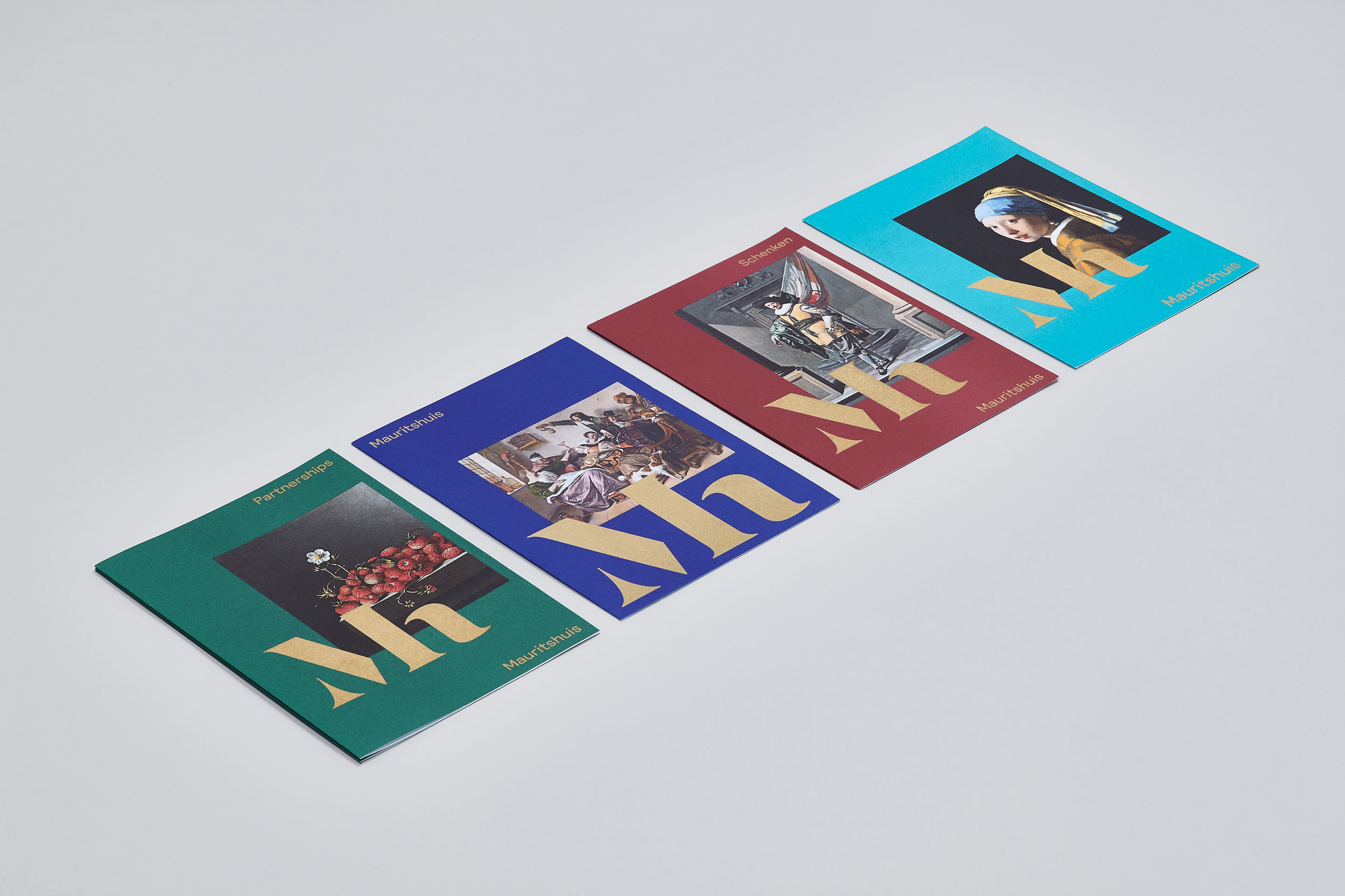
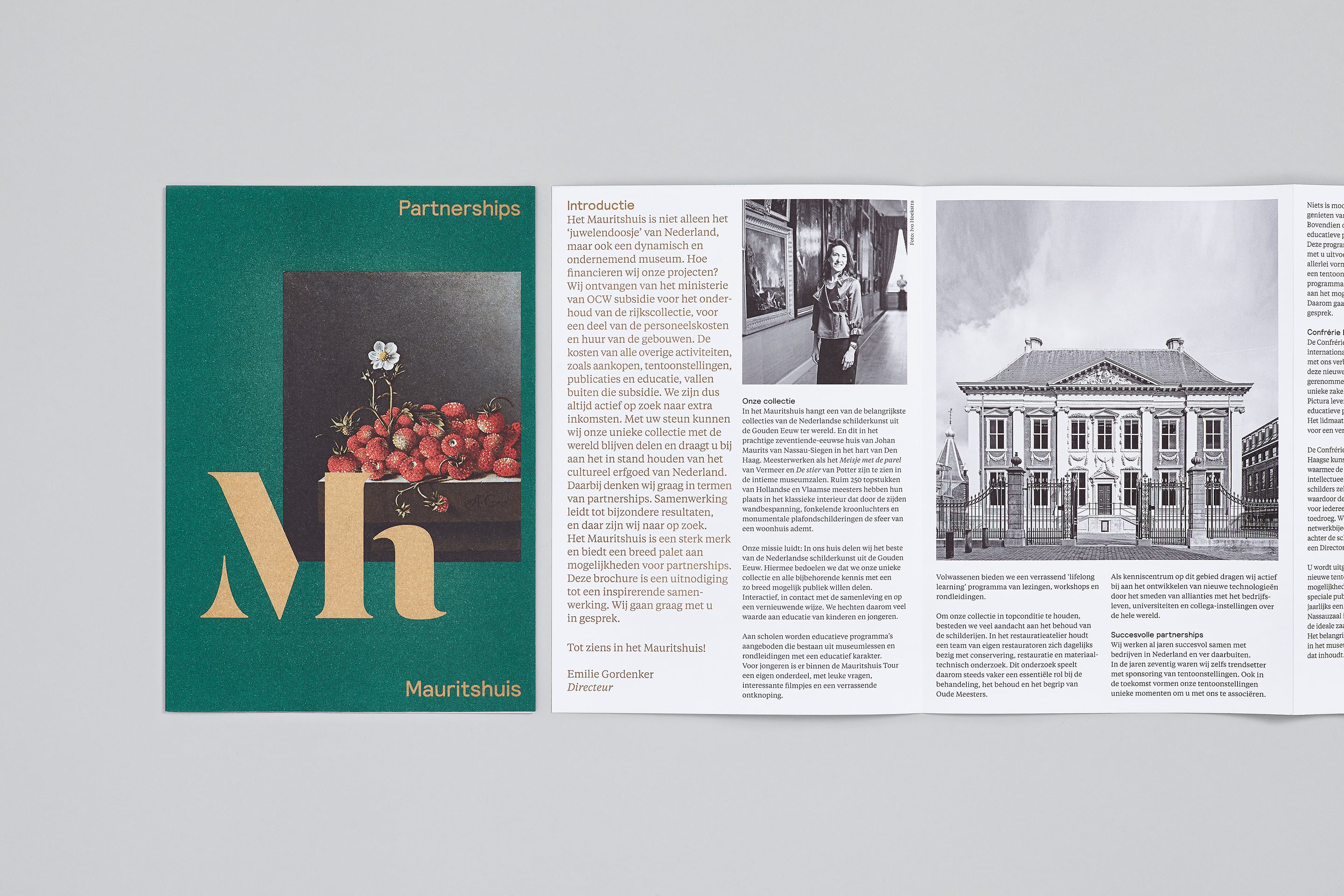
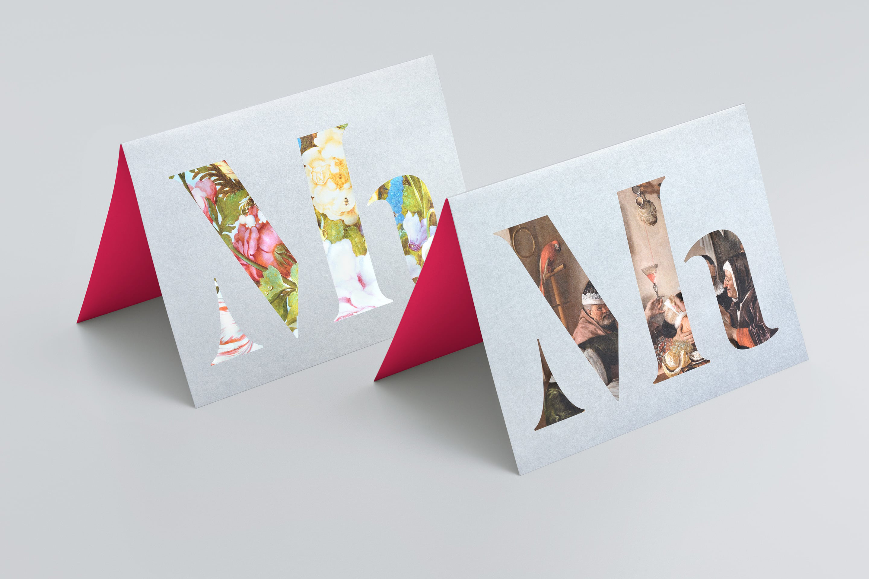
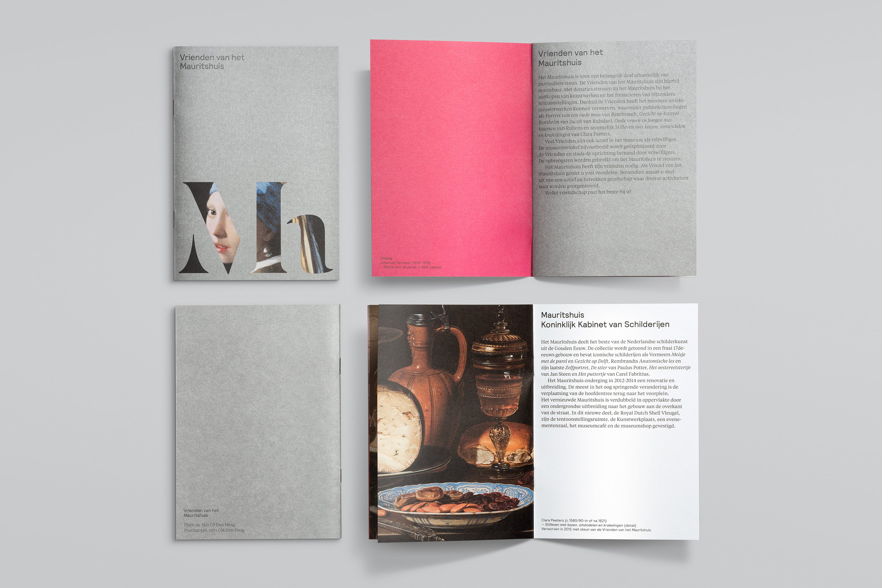
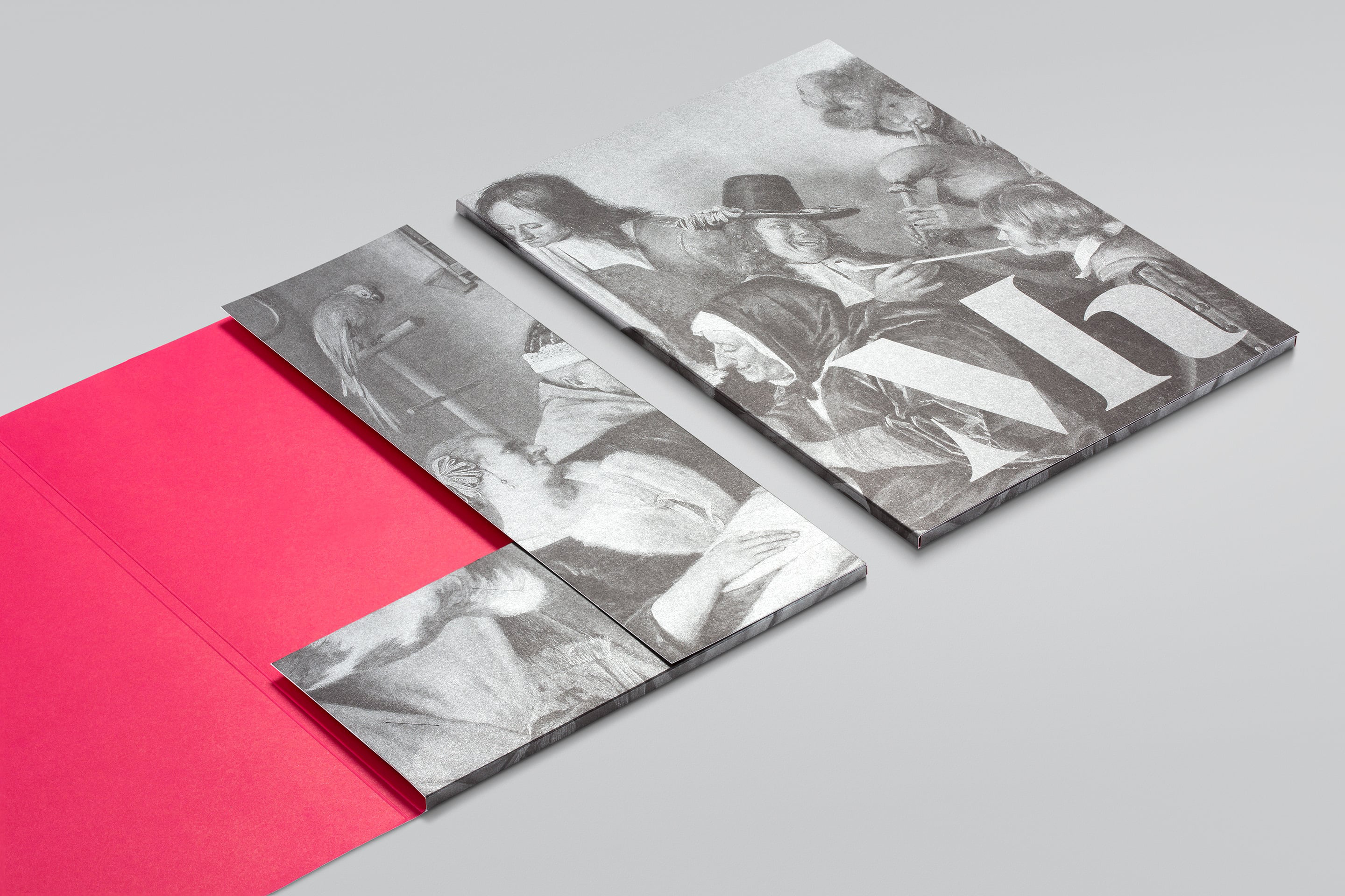
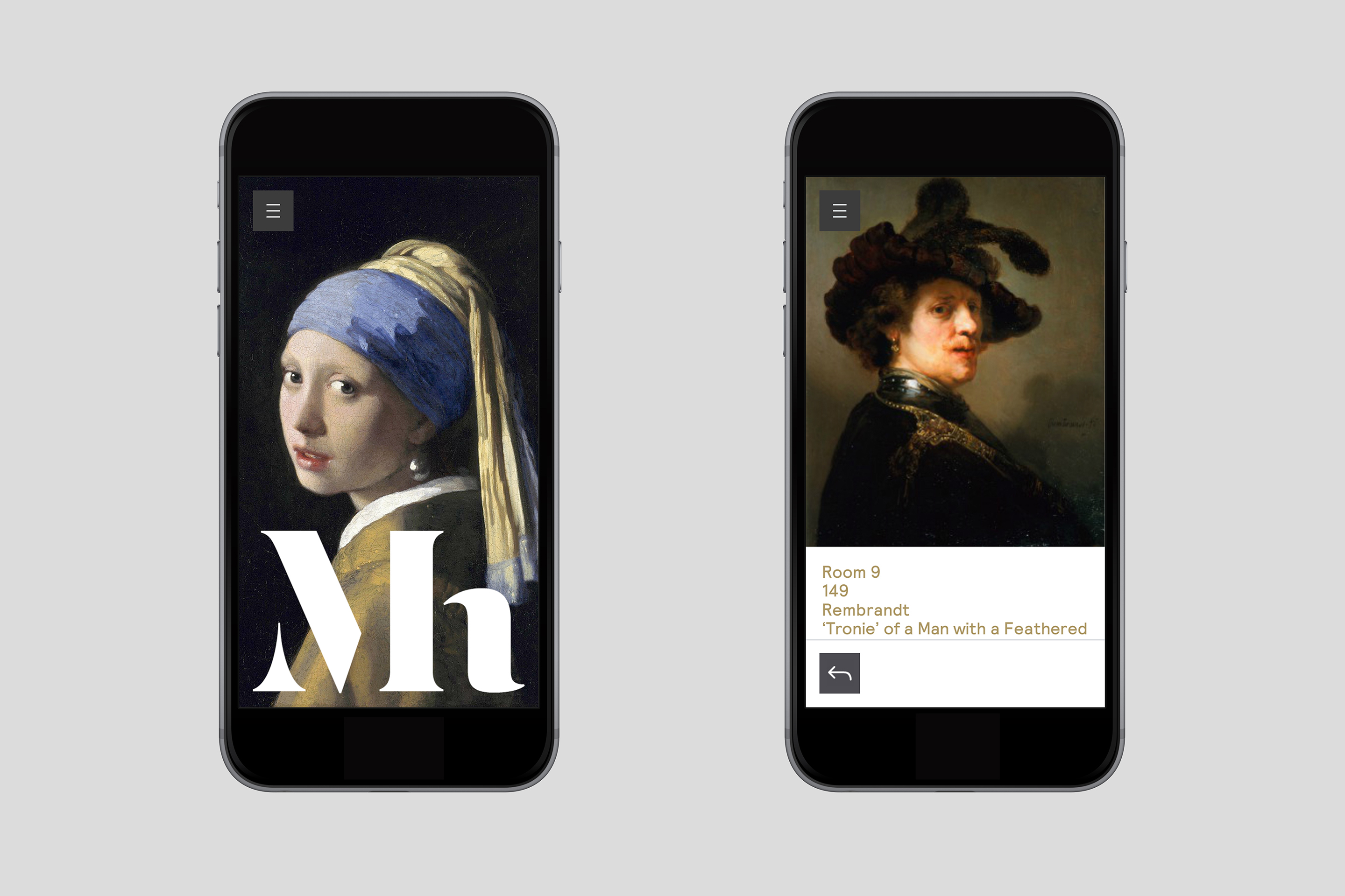
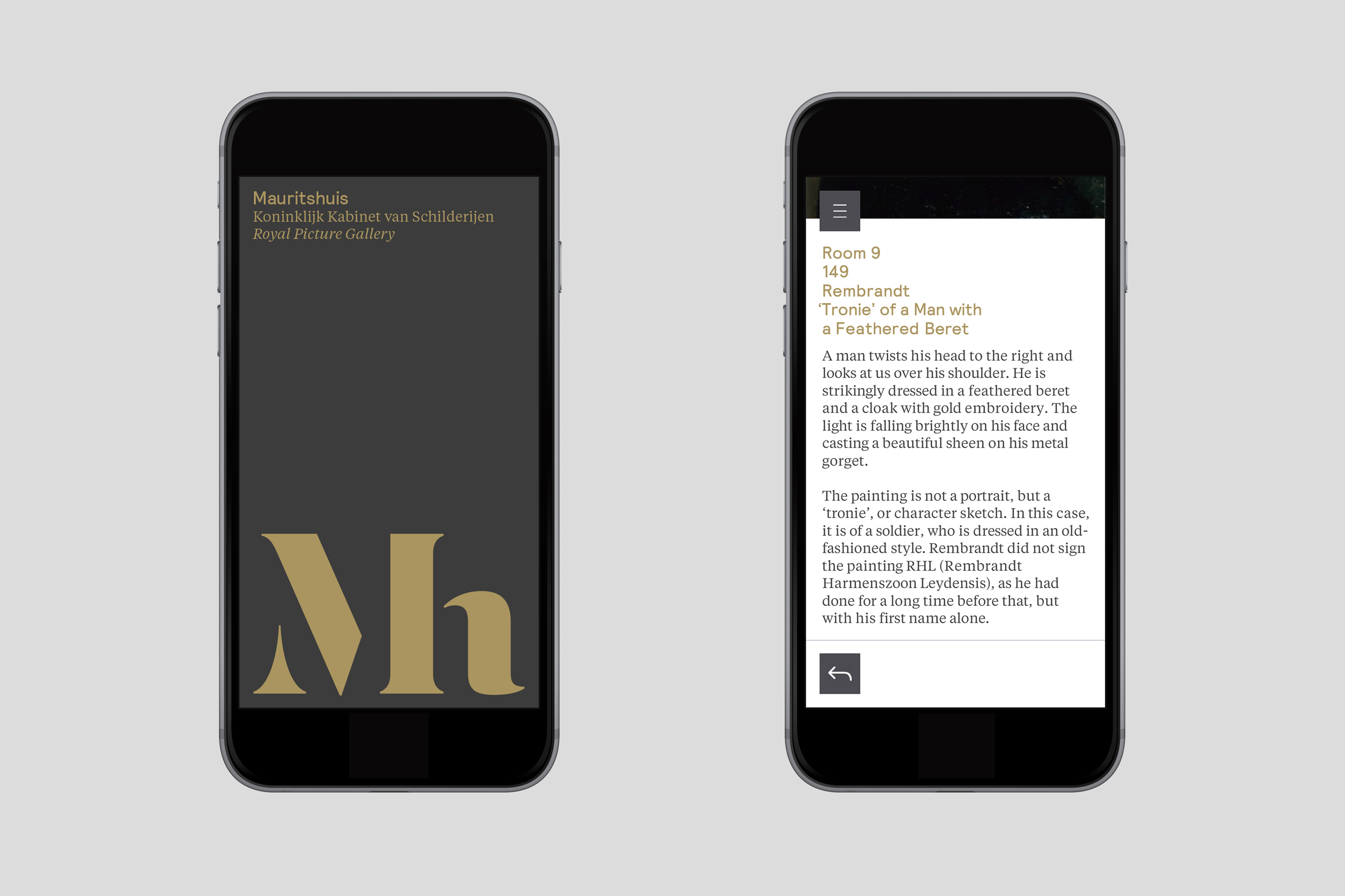
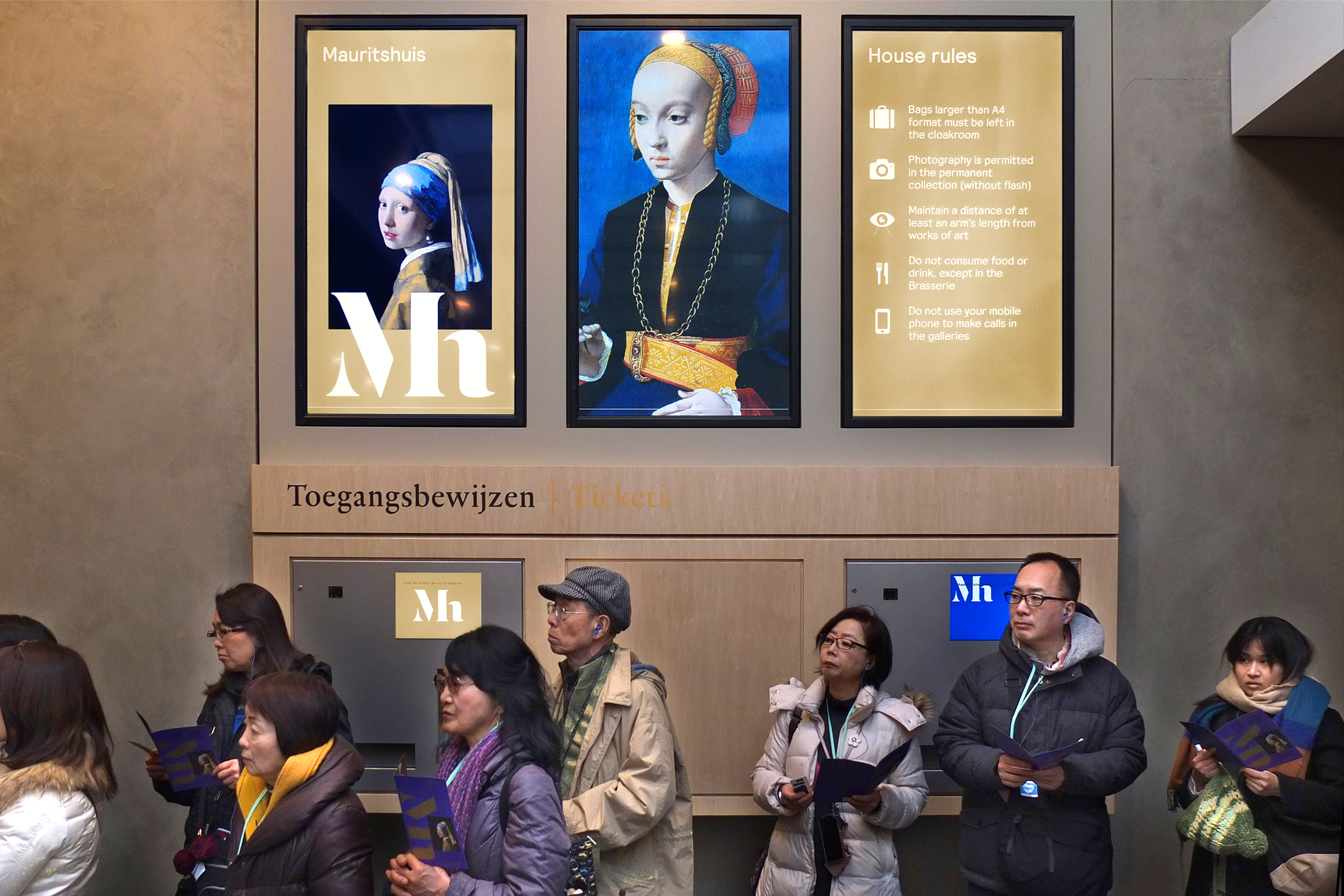
Inspired by artists’ monograms – and supported by a contemporary word-mark – the new logo overlaps reproductions of key paintings, linking the Mauritshuis to its collection. The new photographic style shows paintings within the architectural context of the museum (through doorways, for example), with colour palettes inspired by the Golden Age and the museum’s baroque interior, including its famous damask wall coverings.
Results
Applied to a vast range of collateral, from entrance tickets to trams, as well as a new and comprehensive collection catalogue, the identity has proved immensely popular. The identity clearly attracts attention, yet always remains tasteful. The look and feel is natural, open, and – based on all the feedback we’ve received – it’s been a huge success with visitors.
