South Korean Road Signage — Designing for the Korean highway network

Until recently, South Korea’s road signage system was unclear and therefore unsafe. Individual signs carried too much information (some with Korean, Roman and Chinese characters); signposts were overcrowded with multiple panels and ads installed by third parties. With road safety a major concern, the South Korean government invited Studio Dumbar/DEPT® to design a new and improved interface.
Strategy
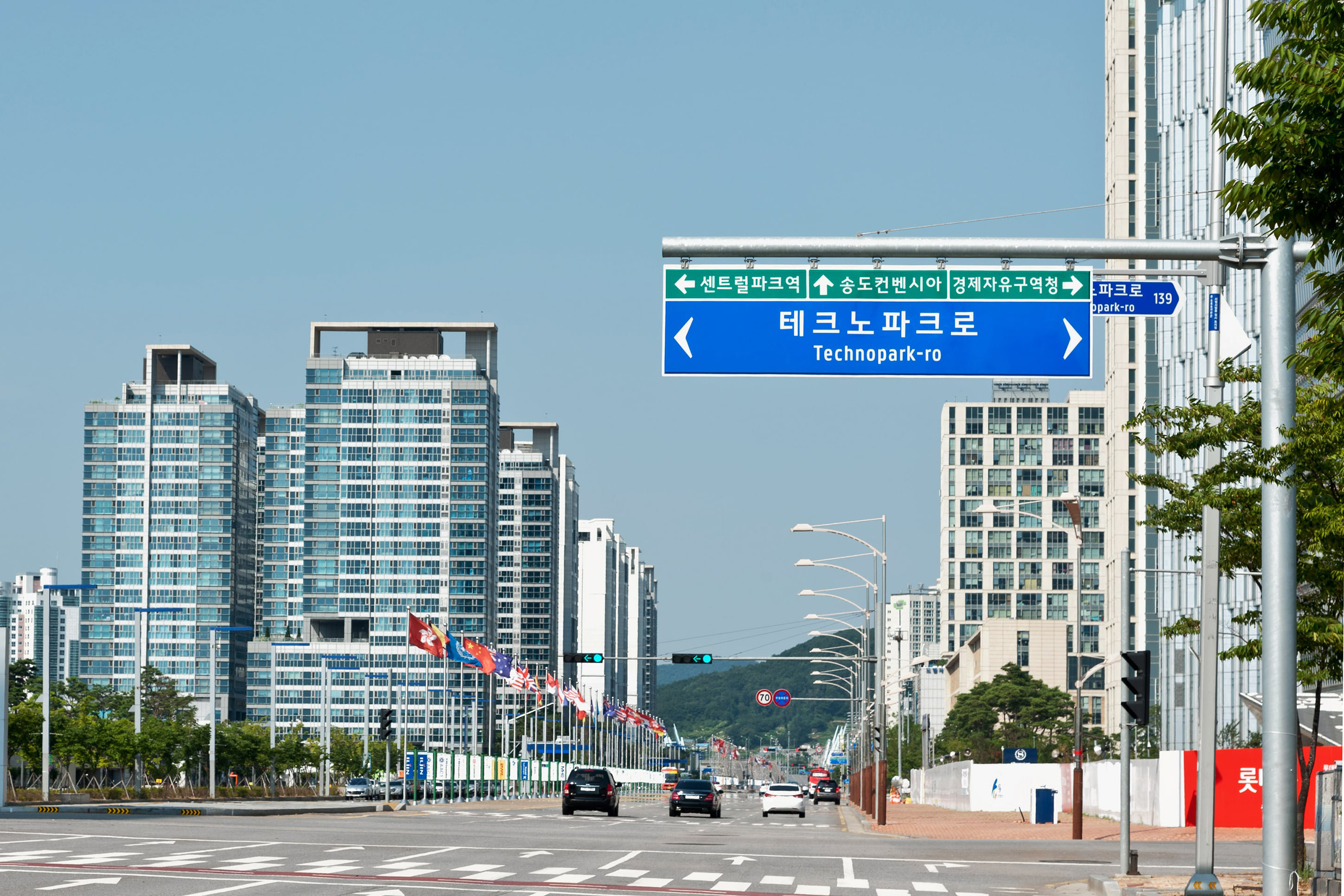
When it comes to road signage, design strategy is driven by the need for clarity of communication. In cases such as this, strategy is a matter of functionality. Information has to be crystal clear – from a distance, up close, for two languages, and all while travelling at different speeds.
Design
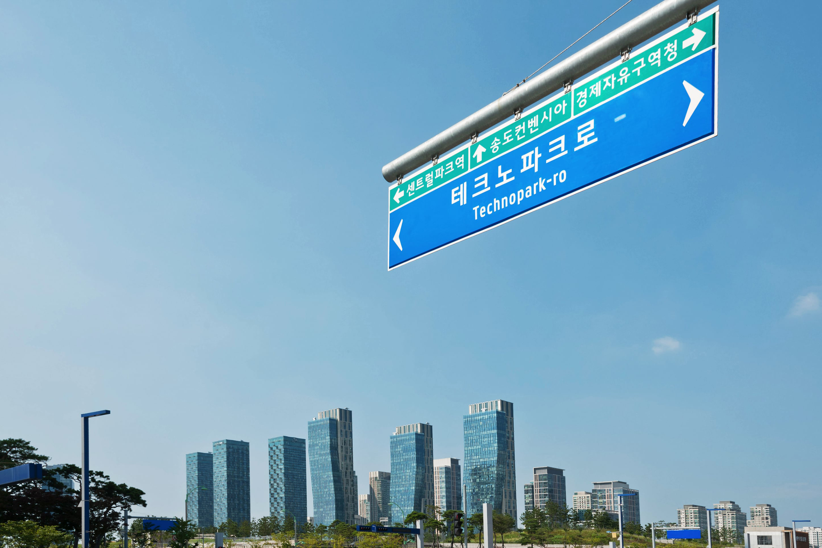
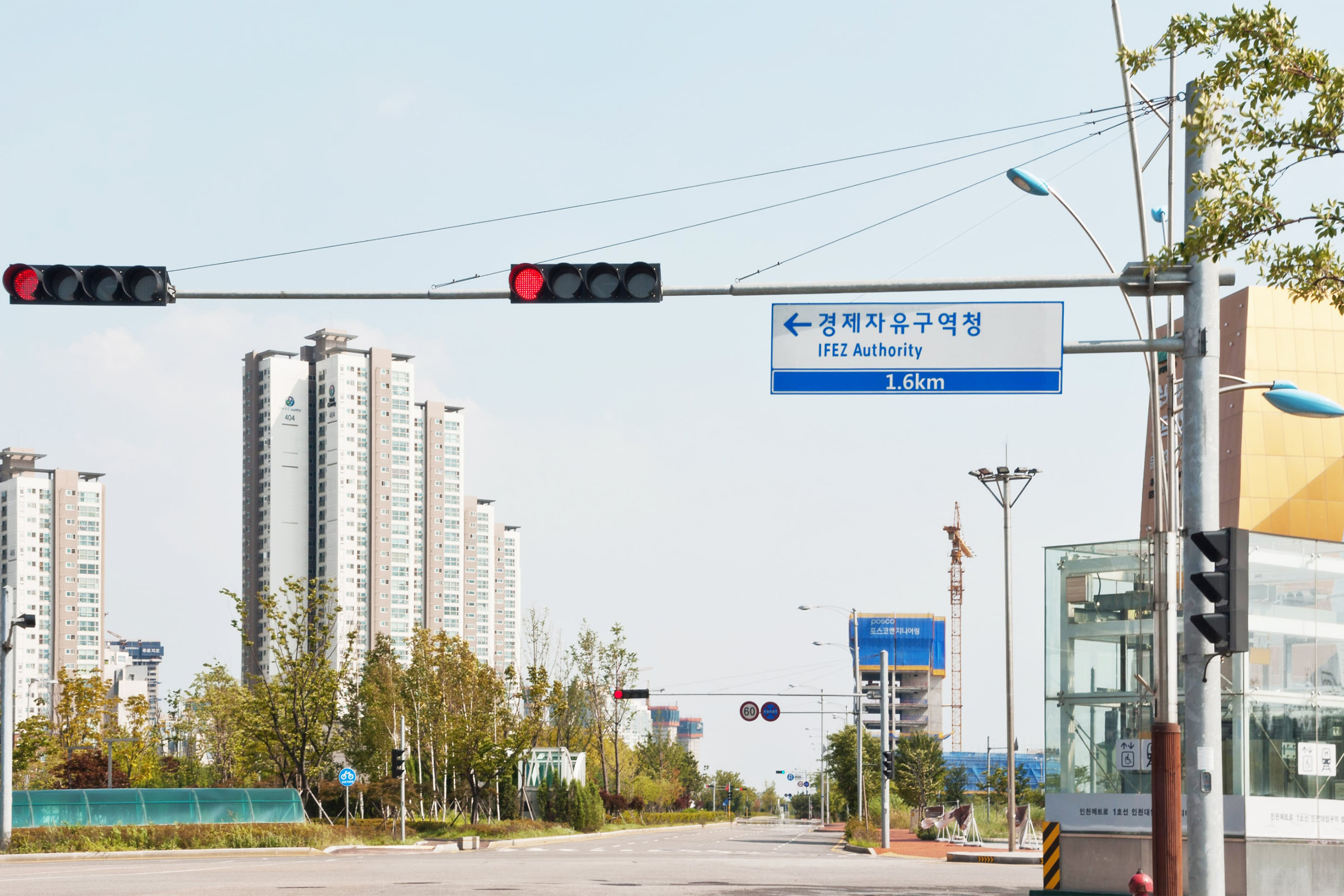
Working with experts from Hong-Ik University in Seoul, we worked on concepts for layout, colour and graphic elements such as arrows, road numbers and pictograms. We introduced a new font, Hangil, custom-designed in several weights in collaboration with type designer Pieter van Rosmalen. Words and letters are widely spaced to ensure optimum legibility and clarity when moving at speed. A special version of the font was created so the optical effect of the lettering remained consistent on different background colours, all of which were darkened to further improve legibility.
Results
The new signage is gradually being implemented nationwide, modernising the look and feel of South Korea’s roads, while improving navigation and safety.

