NPO — Netherlands Public Broadcasting — Visualising unity in a diverse landscape of the Netherlands Public Broadcasting
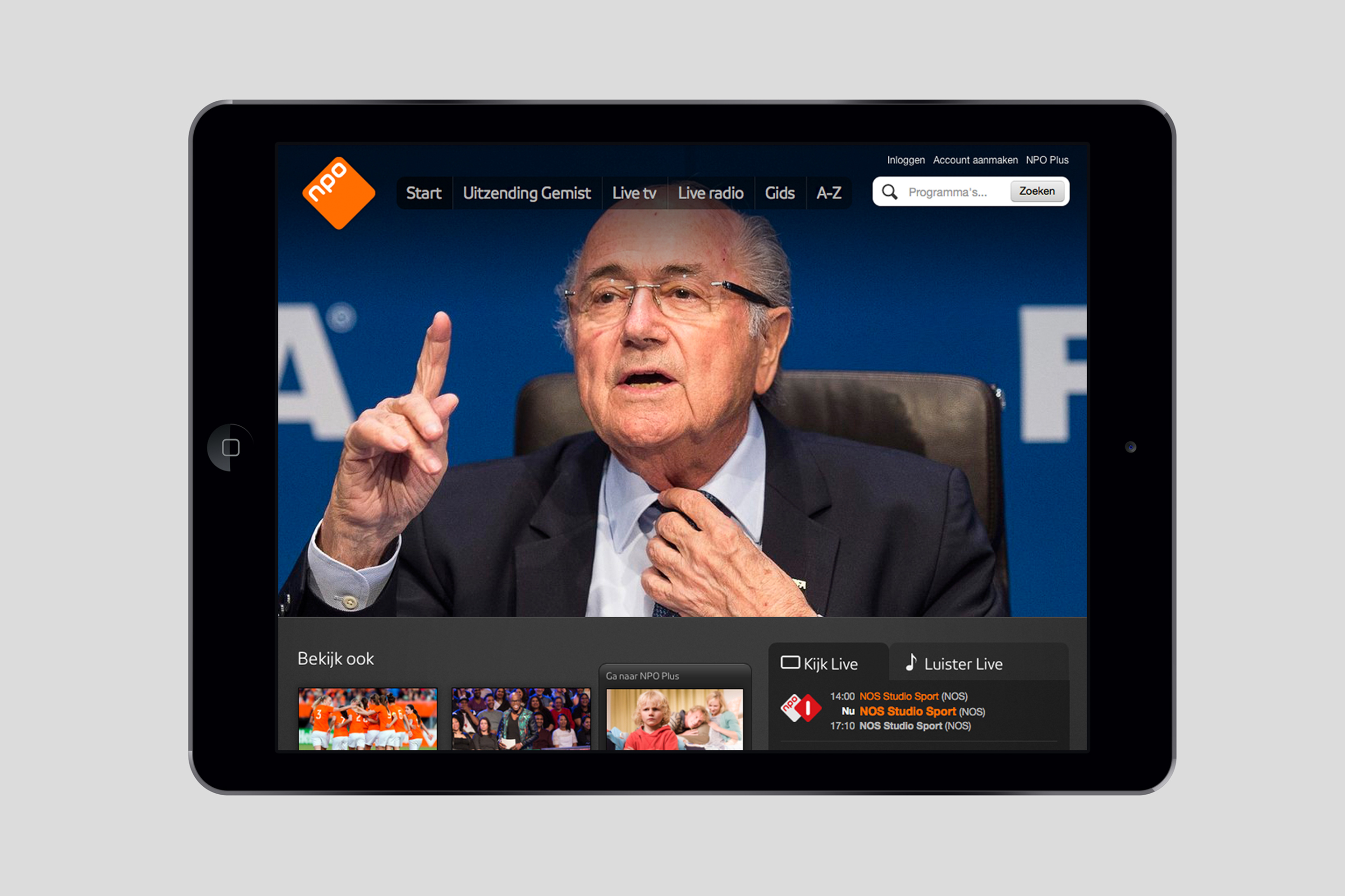
The NPO (Nederlandse Publieke Omroep) is the public broadcaster responsible for Holland’s most popular TV and radio. While they are always at the forefront of the Dutch media landscape, as an organisation they have always stayed in the background. Consequently, the public tends to identify with individual channels, shows and personalities, without knowing they are part of the NPO. The ambition was to rebrand all TV, radio and online channels with the new NPO name and identity.
Strategy
Strategically we focused on the need to make NPO visible throughout all of its programmes and channels, without any dramatic changes or innovations. There was no need or desire to completely overhaul the identity, but to build on the existing equity of the various brands while reinforcing the ‘family’ connection.
Design
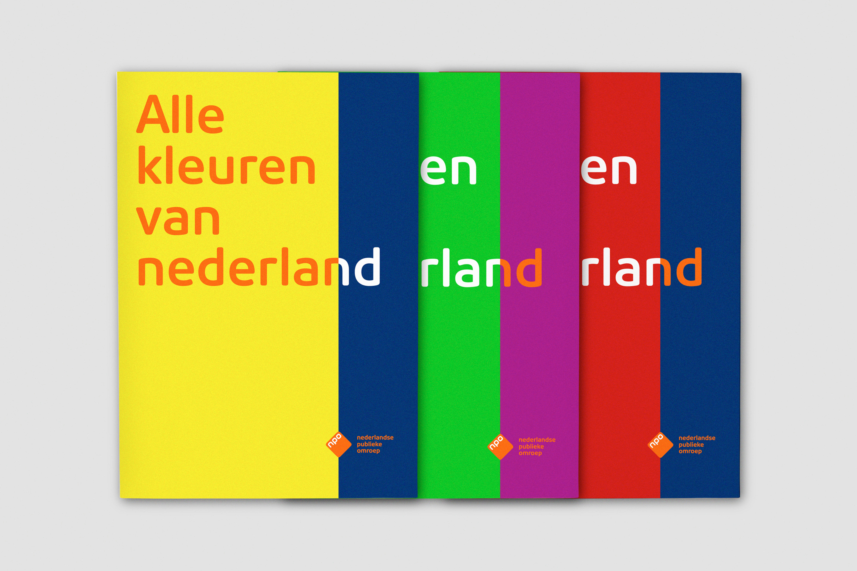
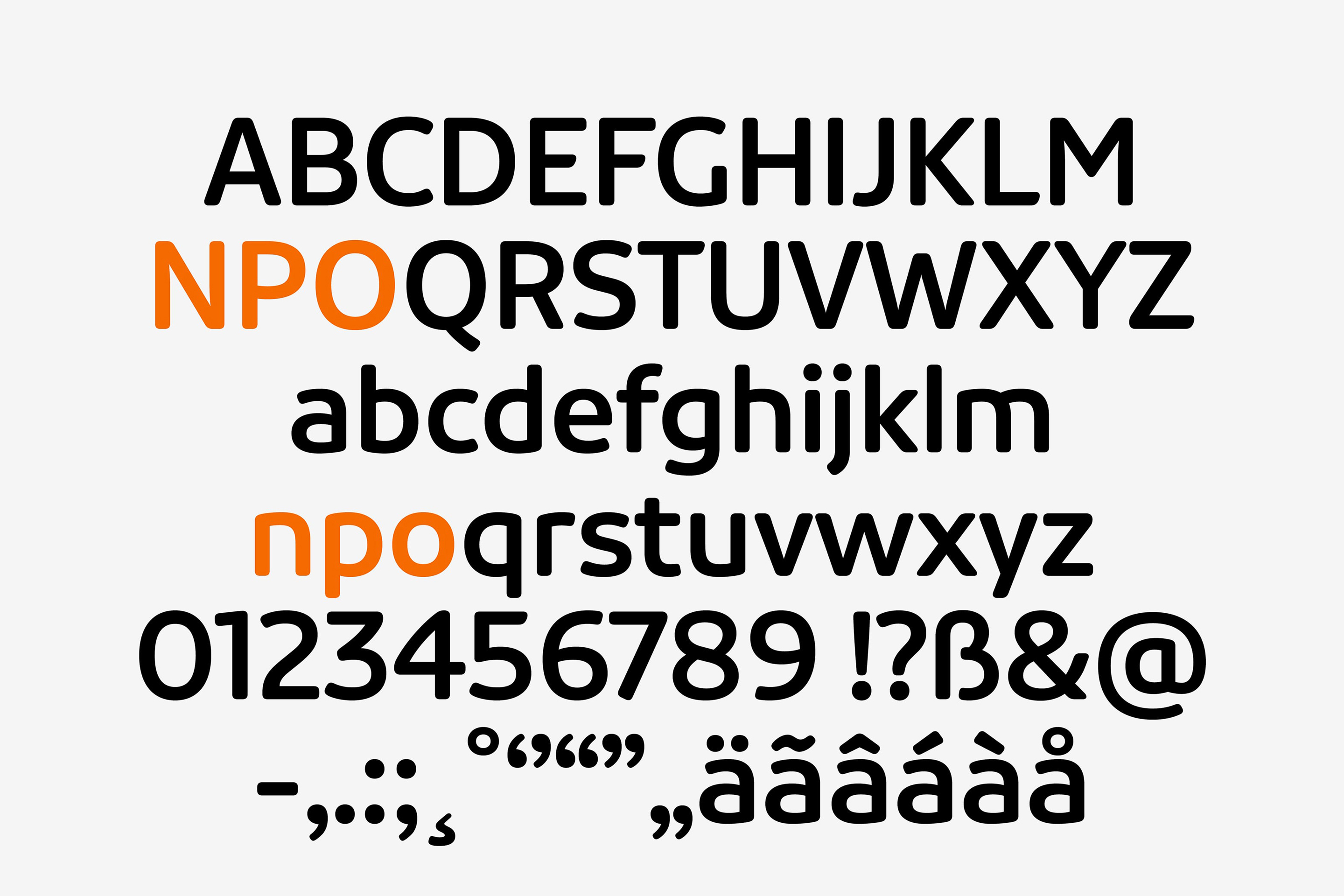
We created a new, custom typeface in collaboration with type designer Pieter van Rosmalen, combining it with a fresh, diverse colour palette and their most recognisable symbol – the NPO diamond. A consistent structure was developed across all TV and radio channel logos (adding the NPO diamond to each one), with images of the nation’s favourite shows and personalities creating a more visible link between the NPO and its most popular programming.
Results
Changing the branding and naming of national organisations such as the NPO will always be subject to scrutiny and debate; both internally and externally. However, while the changes we introduced were significant, they were accepted with relative ease. Implemented across all television, radio and online channels, the new NPO name and identity soon became a household brand.


